YouTube Music Redesign: Contextual Control & Modularity
Project overview & impact
Contextual Control & Modularity: The Redesign that Delivered an 80% Efficiency.
This UX/UI redesign project for YouTube Music focused on optimizing the experience for different users, with different needs. The core goal was to address cognitive overload and streamline critical, repetitive tasks. By focusing on information architecture and flow efficiency, the project achieved significant, quantifiable results:
• 80% Efficiency Increase: Critical task time was reduced from 40s to 8s.
• Usability Score: The System Usability Scale (SUS) score was elevated from 72 to an 85.
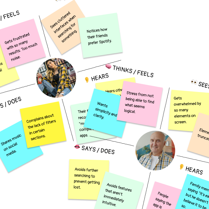
The core problem: noise vs. rhythm
My research, based on user interviews and internet reviews and comments, revealed some friction points that broke the user's flow, but two of them stood out.
Imagine this:
Elena, 22, an aspiring urban DJ, wastes time scrolling through "infinite" screens of redundant recommendations and others, only to fail to find the right vibe for the moment.
Carlos, 70, a music lover, closes the app in frustration because a specific search turns into a global search and visual noise.
Two contrasting users: one demands speed, precision and social features; and a senior who prioritizes clarity, simplicity, and control.
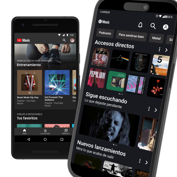
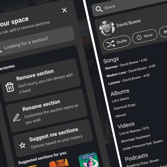
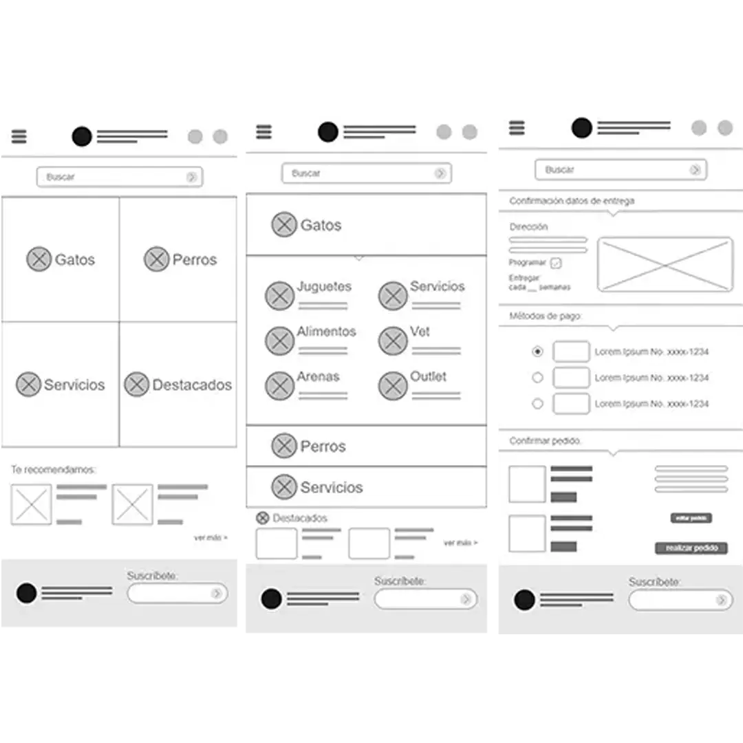
Home screen upgrade: Restoring control with modular architecture
To combat Decision Paralysis, I focused on architectural control rather than adding new features.
By introducing a modular and editable card system, users can now customize their home screen, prioritizing what matters most to them. This approach not only reduces cognitive load but also empowers users to tailor their experience, leading to faster access to desired content and a more personalized interaction with the app.
The 14 sections can now be reduced and reorganized into a clearer, more hierarchical structure.
A key feature was introduced allowing the user to "Edit Their Space". Users can now remove, reorder, or rename sections from the Home Screen.
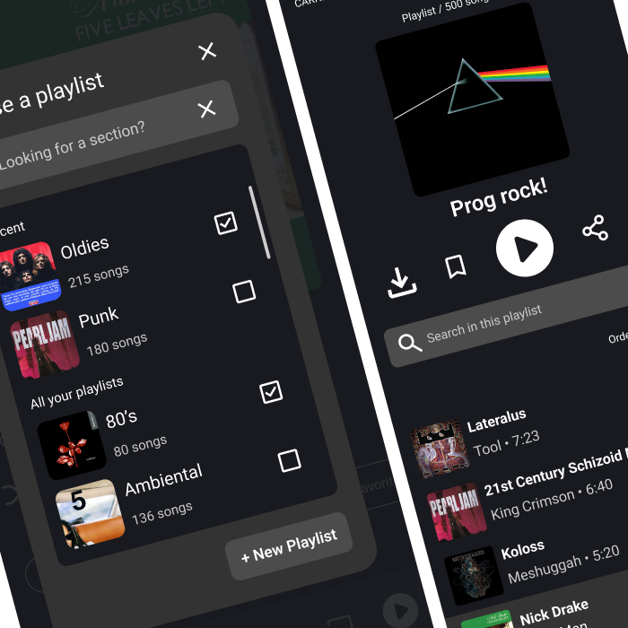
The 80% efficiency boost
To resolve Elena's frustration and the critical time-loss, the user flow for saving content was re-engineered.
Key Components Implemented
Multi-Select Save Modal: The new modal for saving tracks was designed with multiple selection (checkboxes). This eliminated the need to repeat the save action for every playlist, tackling the repetition problem directly, reducing the critical task time.
Contextual Playlist Search: A "Search within this playlist" bar was integrated directly into the playlist view. This allows the user to find content immediately inside the current context, avoiding the frustration of having to scroll endlessly through long playlists.
Older projects
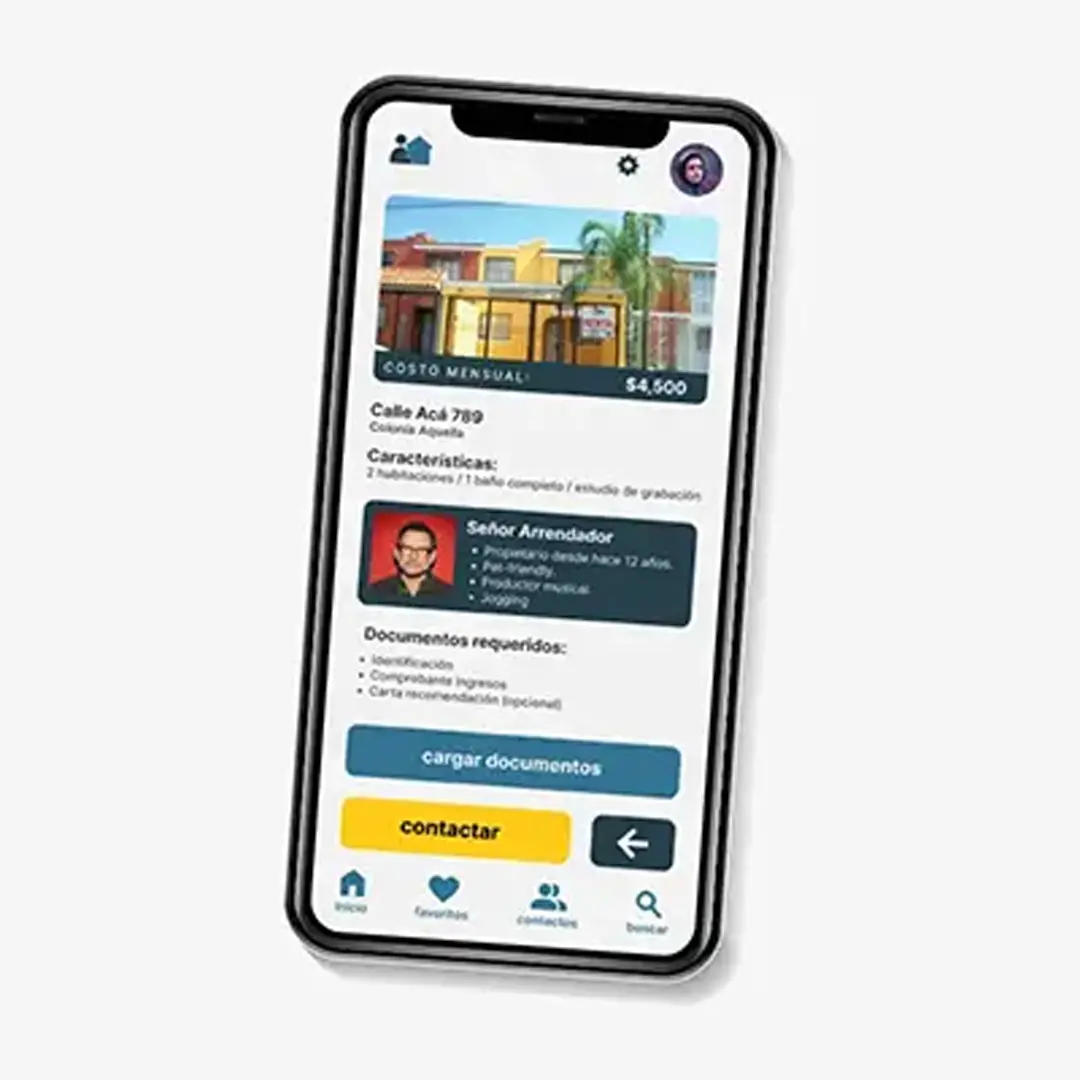
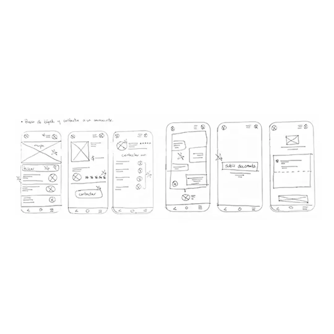
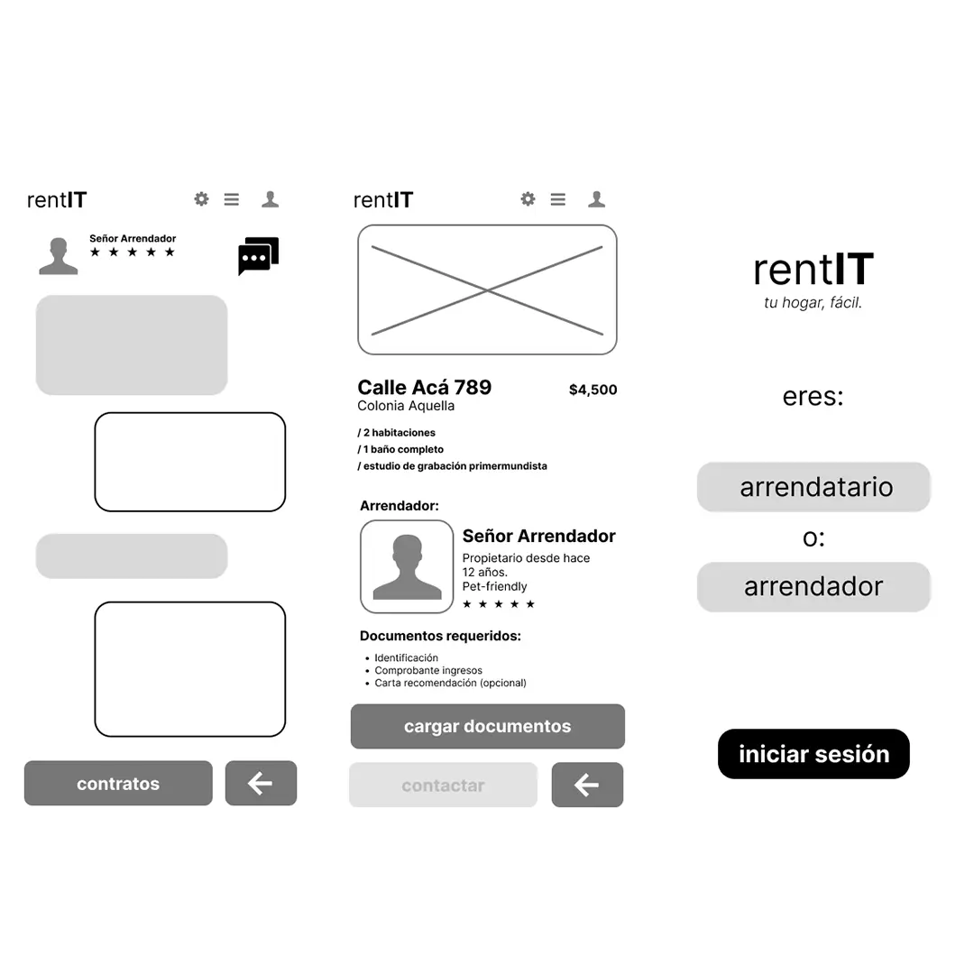
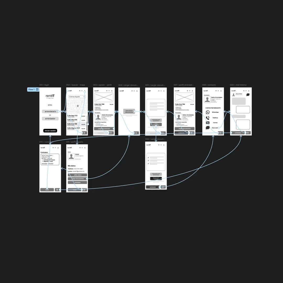
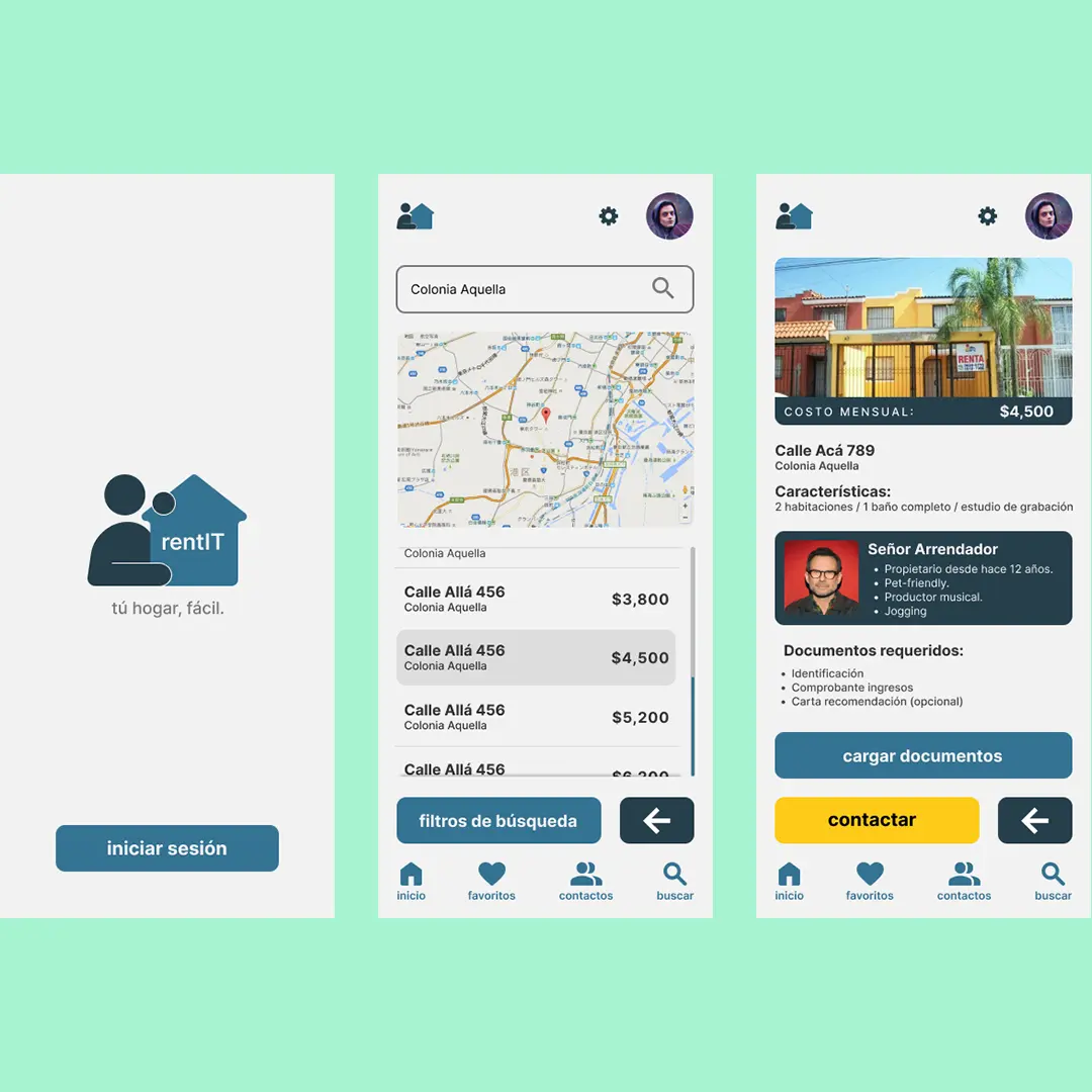
rentIT
branding / UX
rentlT es la app donde los usuarios se reunen para lograr rentar una vivienda sin requerir un número exagerado de documentos y gastos extras.
Diseñé la identidad de marca y UX con el objetivo de generar confianza y facilidad de uso para lograr el objetivo; obtener una vivienda entre usuarios con buena reputación como arrendadores e inquilinos.

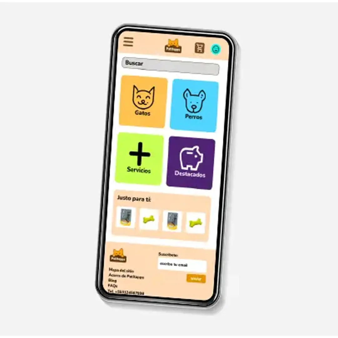
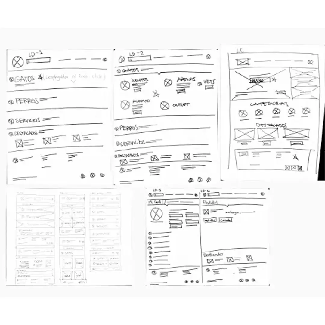
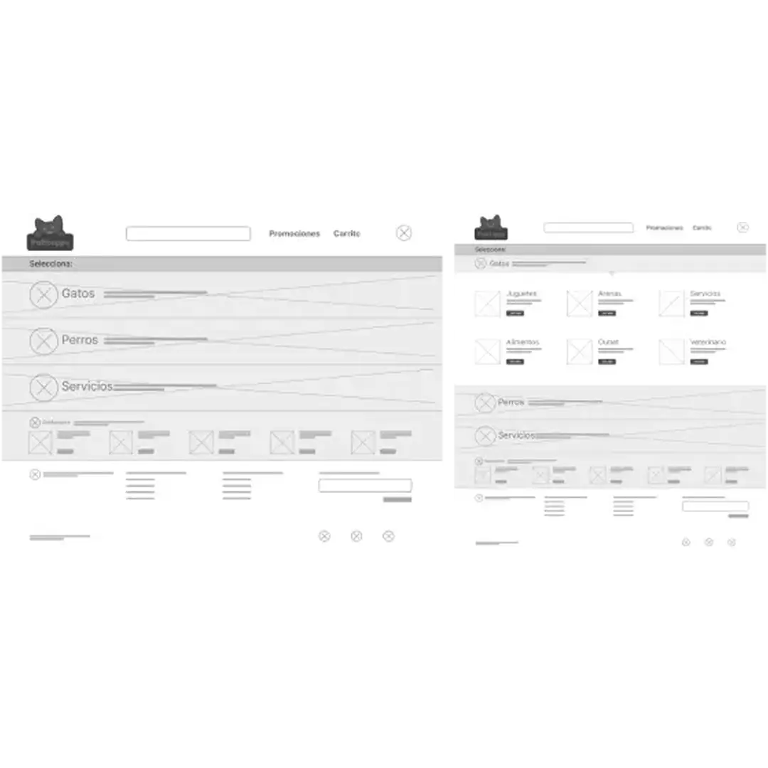
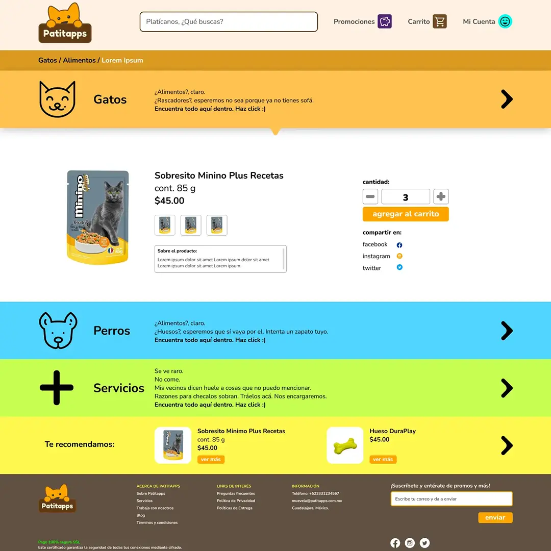
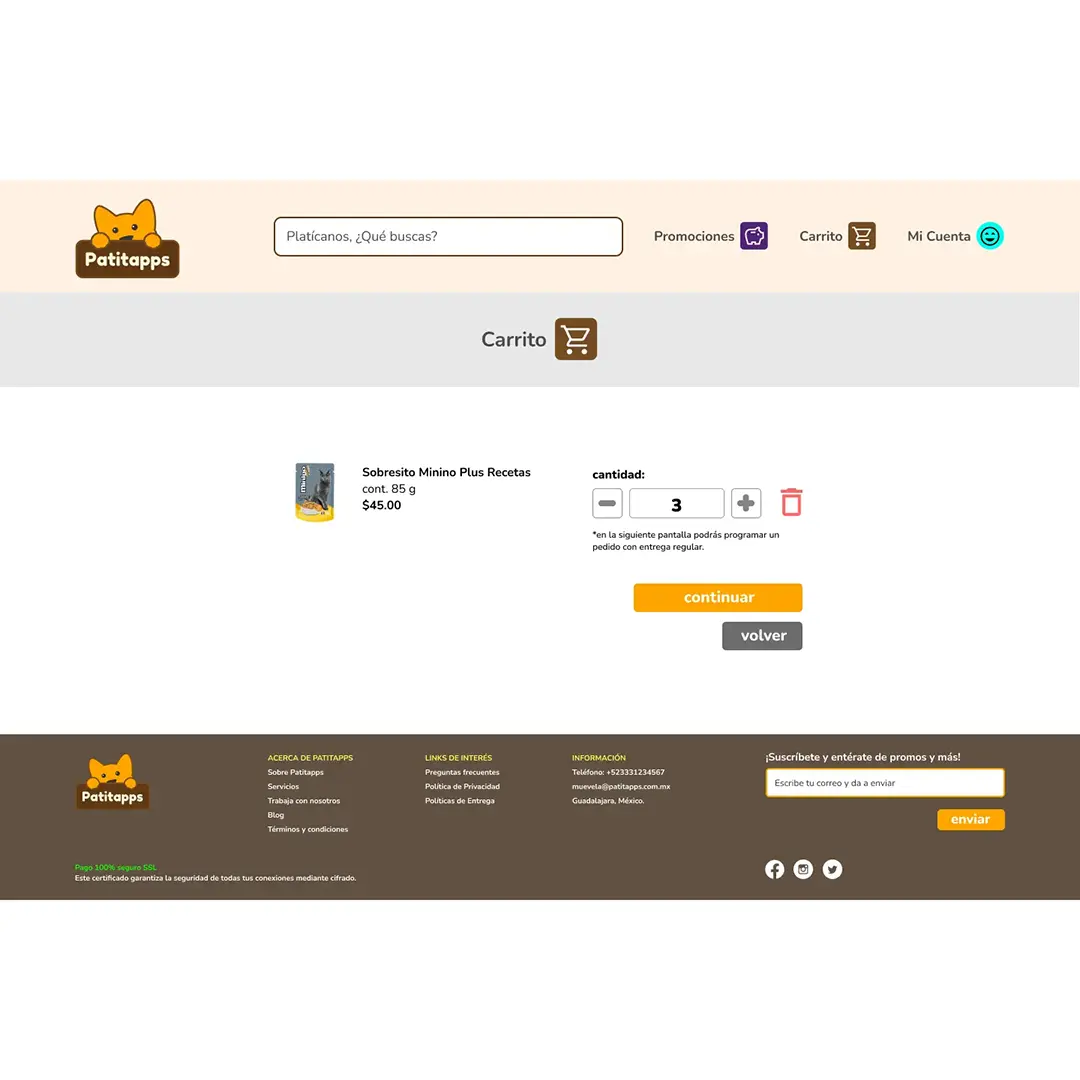
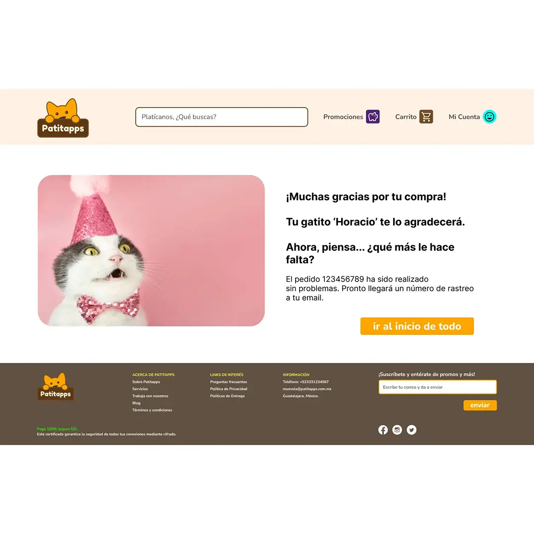
patitapps
branding / UX
Las personas cada vez se llenan más de actividades por la creciente alza de precios en movilidad, insumos, etc. lo cuál hace cada vez más complicado atender todos los pendientes como uno quisiése.
Diseñé la identidad de marca y UX con el objetivo de generar confianza y facilidad de uso para lograr el objetivo; la facilidad de programar la compra correcta de los insumos requeridos por el cliente periódicamente.

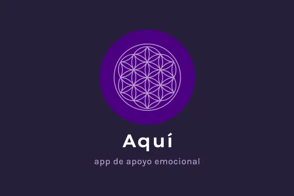
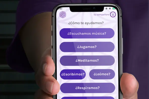
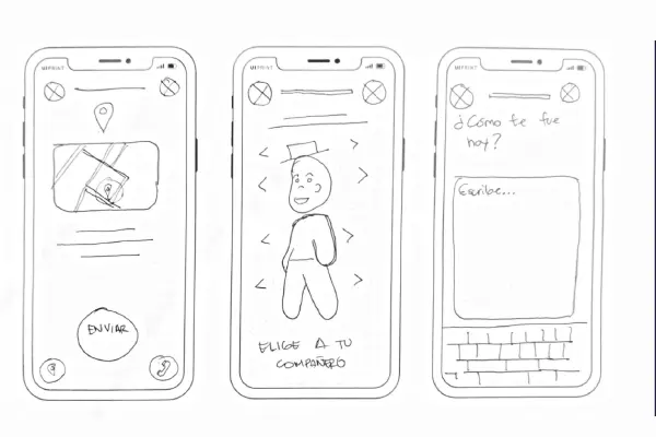
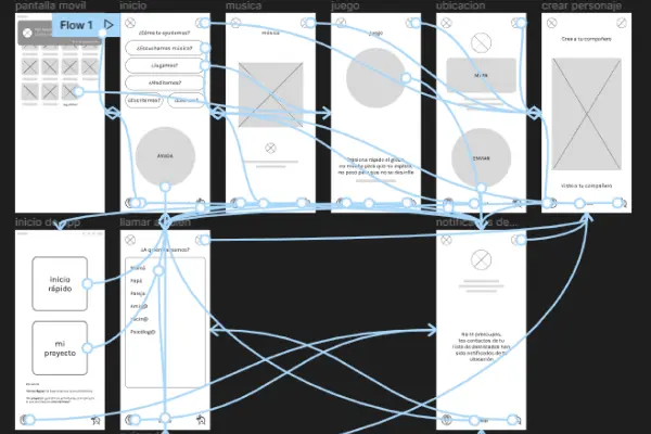
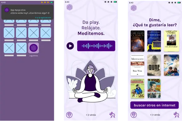
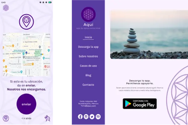
Aquí: apoyo emocional
branding / UX
La app ‘Aquí’ pretende ser una solución simple, rápida y amigable a la cual recurrir en momentos donde uno, simplemente, se congela ante la ansiedad o alguna otra afección, tratando de ganar tiempo para ser atendido como correponde.
Diseñé la identidad de marca y UX con el objetivo de generar confianza y facilidad de uso para lograr el objetivo; sentir que una app se preocupa por ayudar a quienes tienen la necesidad pero no los medios para cubrirla cómo quisieran y así facilitar su manejo de momentos de ansiedad y otras afecciones.